React-Liquid-Fill
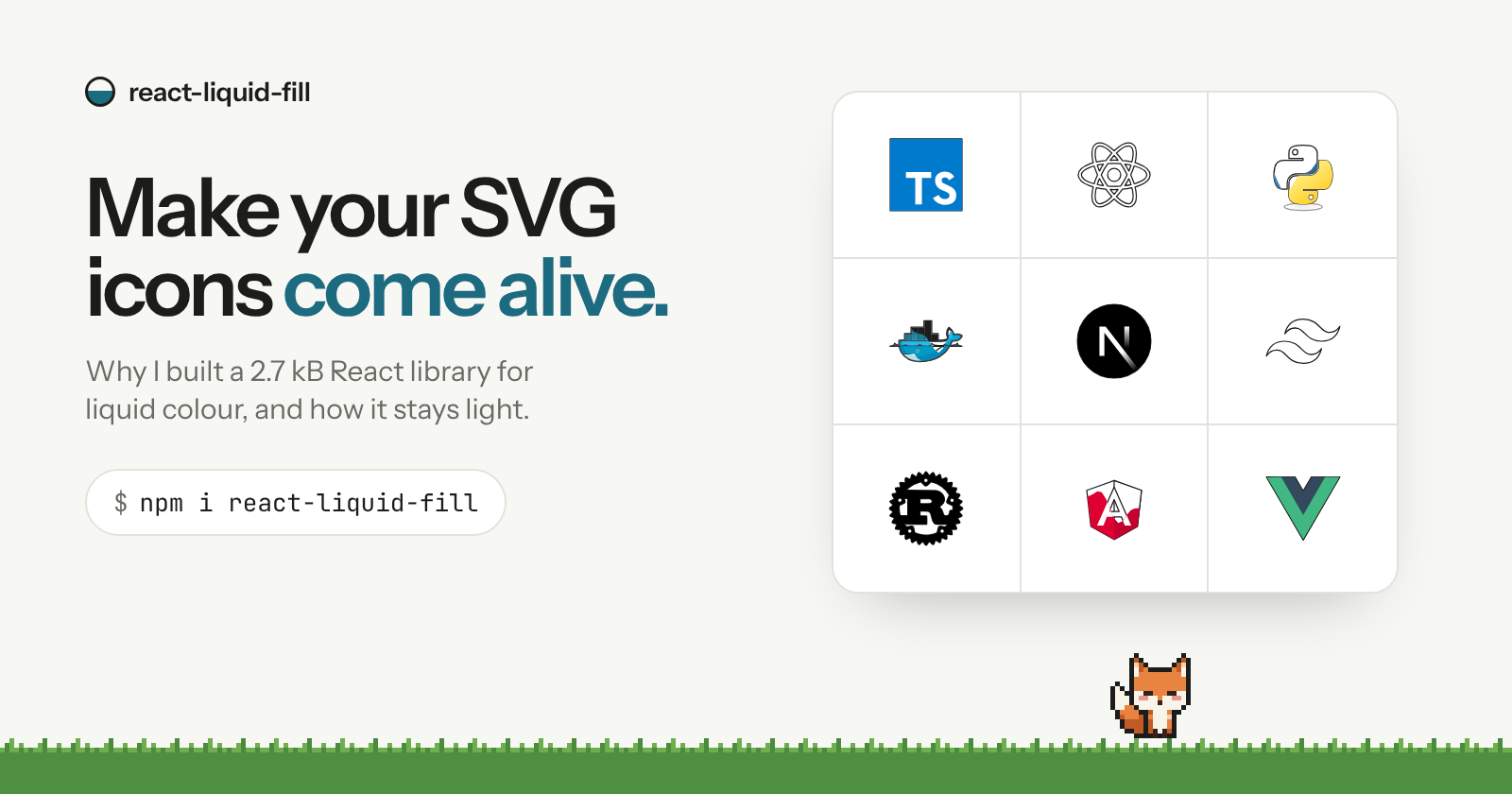
I couldn't find a fun, reusable way to bring SVG icon colours to life, so I built one. Colour pours into any icon from the side your cursor enters. 2.7 kB, zero dependencies, any icon set, plug and play. Open source. 🦊
I do stuff on the Web 🕸️
It started with a row of dull icons
Almost every portfolio, landing page and docs site I've built has the same row: the tech stack. A set of SVG logos, sitting there in flat grey or full colour, doing nothing.
I wanted those icons to feel alive. I wanted the colour to arrive when you reached for it, pouring into the outline like liquid, from the side your cursor came in.
So I went looking, and I couldn't find anything that brought SVG colours in that way: functional, reusable, and actually fun to interact with.
So I built it, and made it work on any SVG, any icon set, and anything else you can render: react-liquid-fill.
Why not just use what exists?
I had three options, and none of them felt right:
Copy the code into each project. Effects like this usually live as one-off code tied to one component and one icon set. Every reuse means untangling it again.
Reach for a full animation library. They are excellent, but pulling in a general-purpose motion library for one hover effect is a lot of weight for a small detail.
Fake it with CSS. A colour transition or a straight wipe is easy. The liquid edge that rolls, swells and settles is the part that makes it feel good, and plain CSS can't follow the pointer's direction.
What I wanted was small, did one thing very well, and didn't care what I pointed it at.
What react-liquid-fill is
react-liquid-fill stacks two versions of anything, a quiet base and a coloured fill, and reveals the top one with an animated liquid edge. It is three small pieces:
| Piece | What it does |
|---|---|
<LiquidFill /> |
The plug-and-play component. Give it two layers, done. |
useLiquidFill() |
The hook underneath, for when you want your own markup. |
liquidPolygon() |
The wave geometry on its own, with no React at all. |
The numbers I cared about most:
About 2.7 kB minified and gzipped, measured from the actual build.
Zero dependencies besides React. No stylesheet to import, no provider to wrap your app in.
React 18+, ESM and CommonJS builds, and full TypeScript types.
Ready for Next.js: the bundle ships with
"use client"and is safe to server-render.
Plug and play, with any icon set
Install it:
npm install react-liquid-fill
Then give it a base and a fill. Hover and keyboard focus work immediately:
import { LiquidFill } from "react-liquid-fill";

<LiquidFill
  base={<img src="/logo-outline.svg" alt="" width={48} height={48} />}
  fill={<img src="/logo.svg" alt="" width={48} height={48} />}
  role="img"
  aria-label="Acme"
/>
The library doesn't ship icons, and it doesn't care where yours come from. You only need two renderings of the same thing:
// SVG icon components: react-icons, Simple Icons, MUI icons
<LiquidFill
  base={<SiReact size={48} color="#c9c9c4" />}
  fill={<SiReact size={48} color="#149ECA" />}
/>

// Stroke icon sets: Lucide, Heroicons, Phosphor
<LiquidFill
  direction="up"
  base={<Heart size={48} color="#9a9a93" />}
  fill={<Heart size={48} color="#e5484d" fill="#e5484d" />}
/>
It works on buttons and text too. And hover is only one trigger:
// Fill as it scrolls into view, staggered across a grid
<LiquidFill trigger="inView" inView={{ delay: index * 70 }} base={…} fill={…} />

// Drive it yourself, e.g. scrubbed by scroll position
const liquid = useLiquidFill({ trigger: "manual" });
liquid.setProgress(0.4);
How it stays light and fast
The whole effect is two layers and one moving clip-path. Here is what happens when your cursor arrives:
The hook compares where the pointer entered with the element's centre, so the liquid pours from the side you came from.
A
requestAnimationFrameloop eases progress from 0 to 1 (about 460 ms in, 340 ms out).Each frame,
liquidPolygon()turns that progress into apolygon()with a rolling, wavy leading edge. The wave swells mid-pour and settles flat when it's full.The polygon is written to one CSS custom property,
--liquid-clip, on the element. The fill layer simply usesclip-path: var(--liquid-clip).
That last step is the efficiency trick. The animation never goes through React state, so nothing re-renders while it plays. React only hears about it once, when a fill or drain settles. There's no layout work either, just a clip-path changing on one layer.
It also stays polite with the rest of the page: no global listeners, no stylesheet injected, and every frame and observer is cleaned up when the component unmounts.
Tasteful by default
A flashy effect is easy. One that feels good the hundredth time is harder. These are the defaults I spent the most time on:
It follows you. The liquid enters from the side your pointer came from, so the effect responds to you rather than playing a canned animation.
The motion has weight. An ease-out curve, a wave that swells and settles, and a drain slightly faster than the fill.
Keyboard users get it too. Focus triggers the same fill as hover.
Screen readers hear it once. The fill layer is
aria-hidden, so content isn't announced twice.Reduced motion is respected. People who turn animations off get an instant change instead.
Touch is handled. There's no hover on a phone, so
touch="tap-toggle"fills on tap.
And you style everything yourself. The library only writes one CSS variable and two data attributes (data-filled, data-liquid-layer), so it fits Tailwind, CSS Modules or plain CSS without a fight.
Say hi 👋🏽
Scroll to the bottom of the website and you'll find an easter egg wandering along the last section. It's grey. Click it.
It's the best demo I have: driven by the same useLiquidFill hook, with a manual trigger. If the hook can do that, it can handle your icons.
Try it
npm install react-liquid-fill
Website and live demos: react-liquid-fill.vercel.app
Docs and full API: https://react-liquid-fill.com/docs
GitHub: Sashank-Deb/react-liquid-fill
npm: react-liquid-fill
It's MIT licensed and open source. If you use it somewhere, I'd love to see it. And if something feels off, or you want a trigger or option it doesn't have yet, open an issue or drop a comment below. I read all of them.